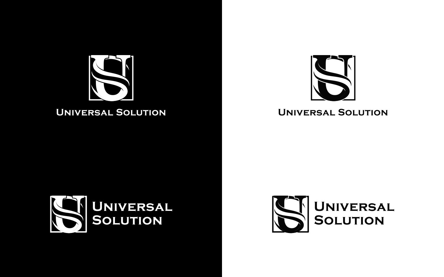
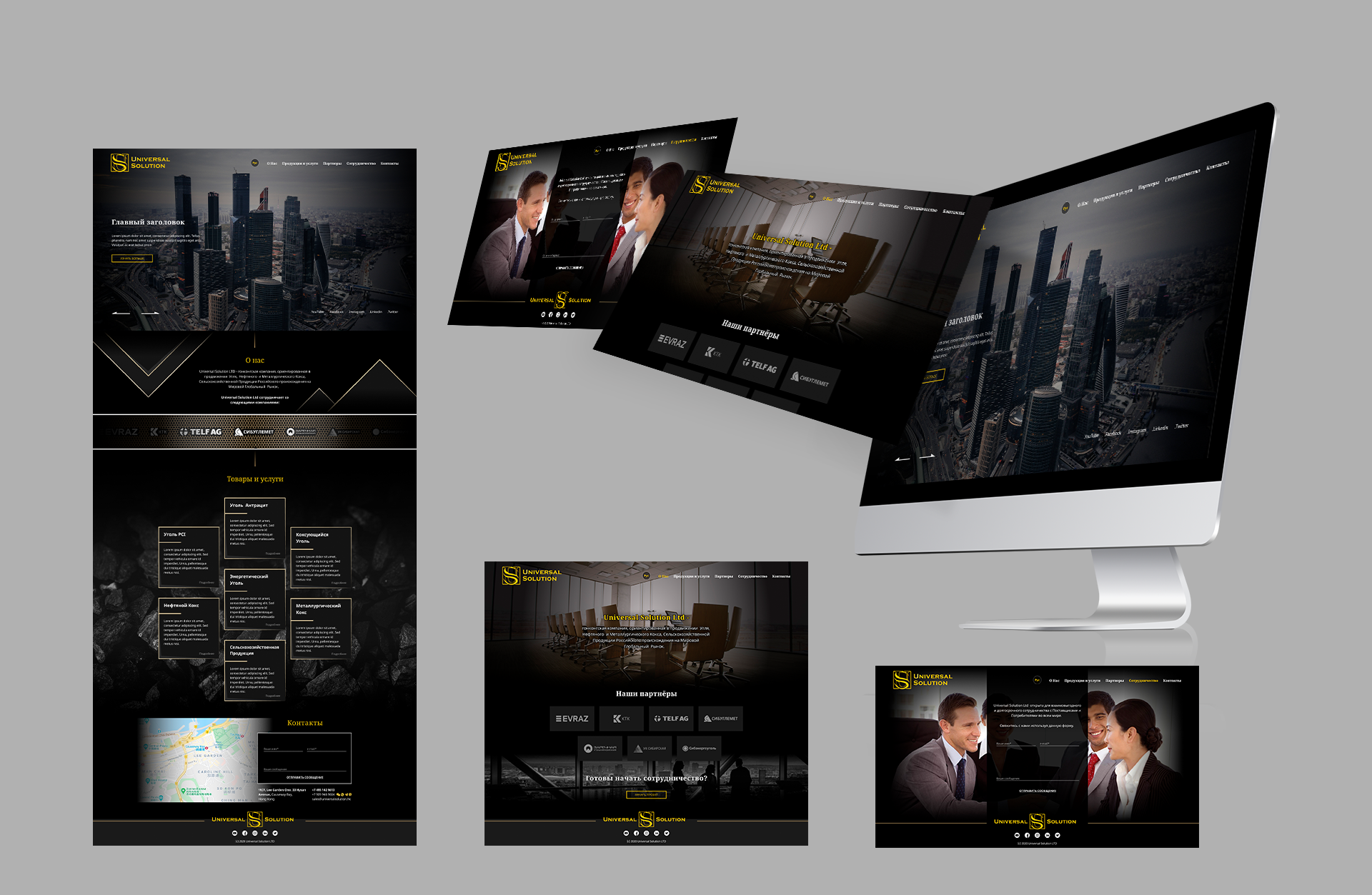
It was a really interesting long-term project. For companies like Universal Solution, it's crucial to maintain laconicism and rigor in their appearance but expressing their values is very important too so we took every opportunity to create
expressive branding.
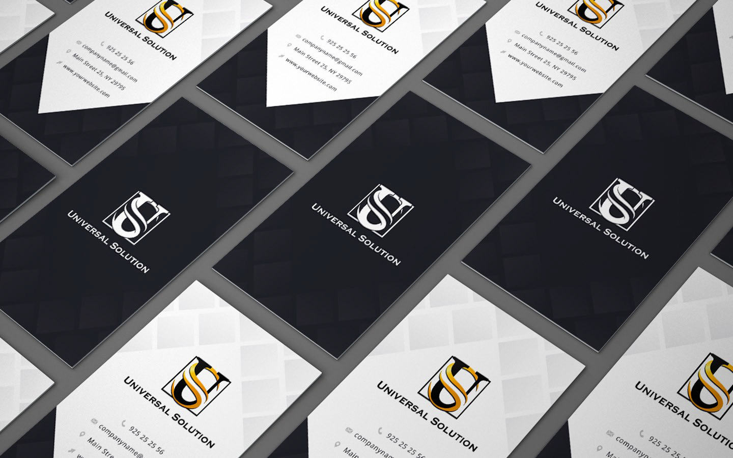
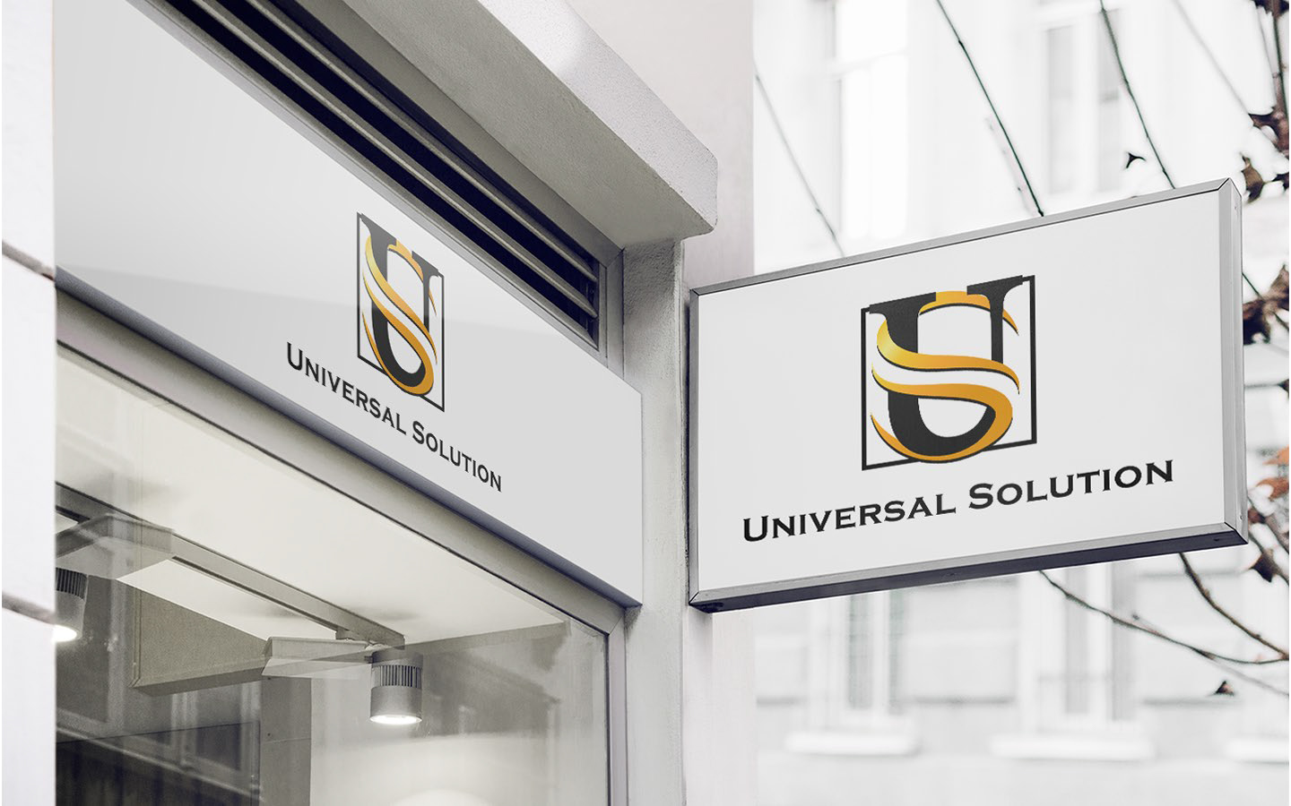
And I think the results are great because in any part of the visual design there's a part of the company beginning with colors, black is coal (the main product of the company) and golden is gold (as profit for the company's
partners). Shapes are also full of the metaphoric meaning square is reliability, the hard shape of "U" and smooth shape of "S" to show universality in solving partner's problems and tasks.


.png)