Have you ever thought about where does all that numerous furniture stores get their goods and how difficult it is for them to expand their assortment? Yes, neither have I, till this project.
My client wanted something simplistic
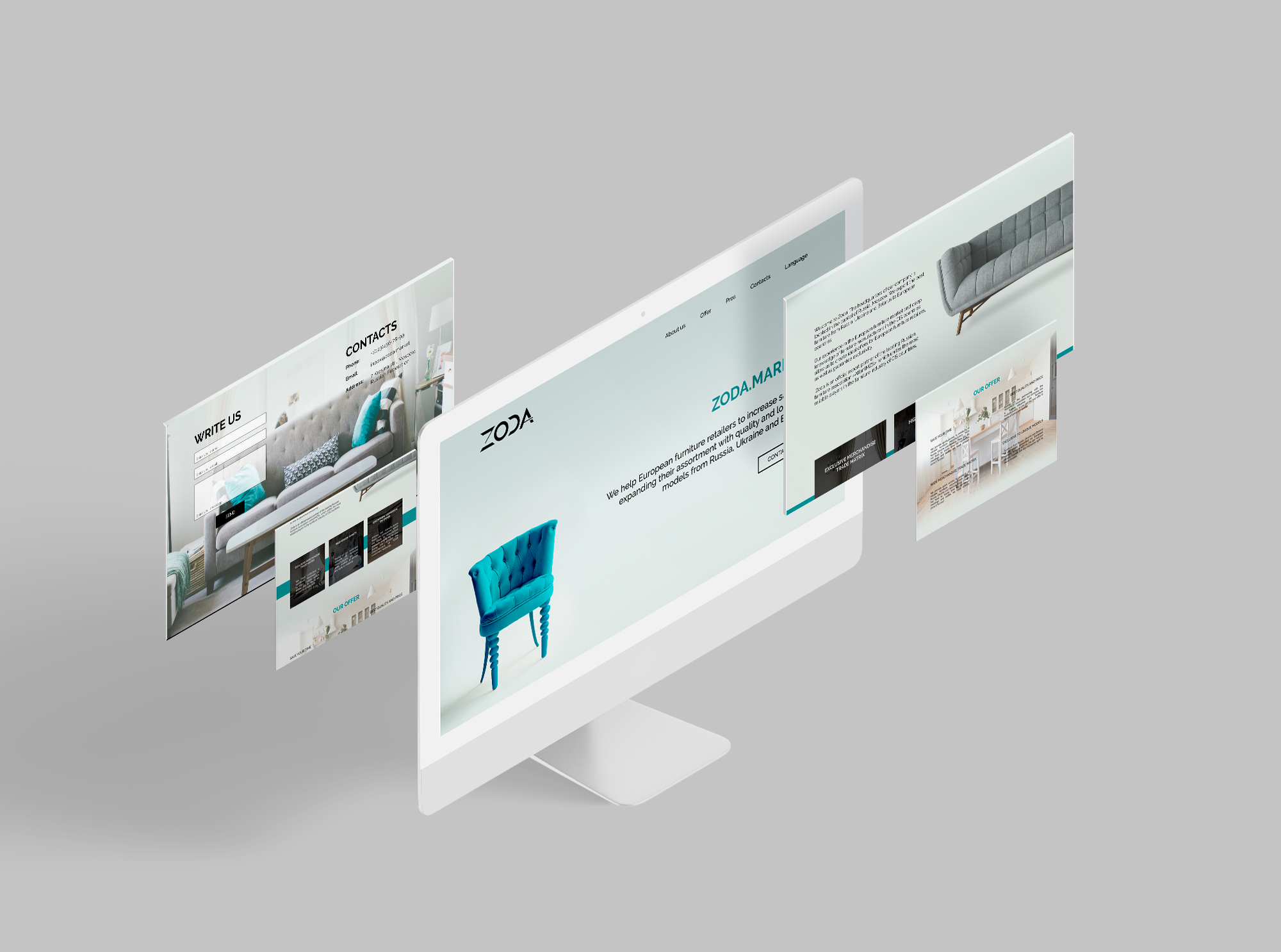
and functional for the branding so I took strict geometrical shapes for the logo and combined them with light and full of air design for the website. In this way, design managed to be simple for the user not overwhelmed with photos
and colors but still looking stylish.


